Navigation Experience
How might navigating a retail sprawl present a bigger experience opportunity beyond just displaying directions?
Context
Working with a client that managed an outdoor retail sprawl in the US midwest, the identified task was to improve navigation across the modest area. Visitors asked for better knowledge of parking locations, movement directions, and retail stores.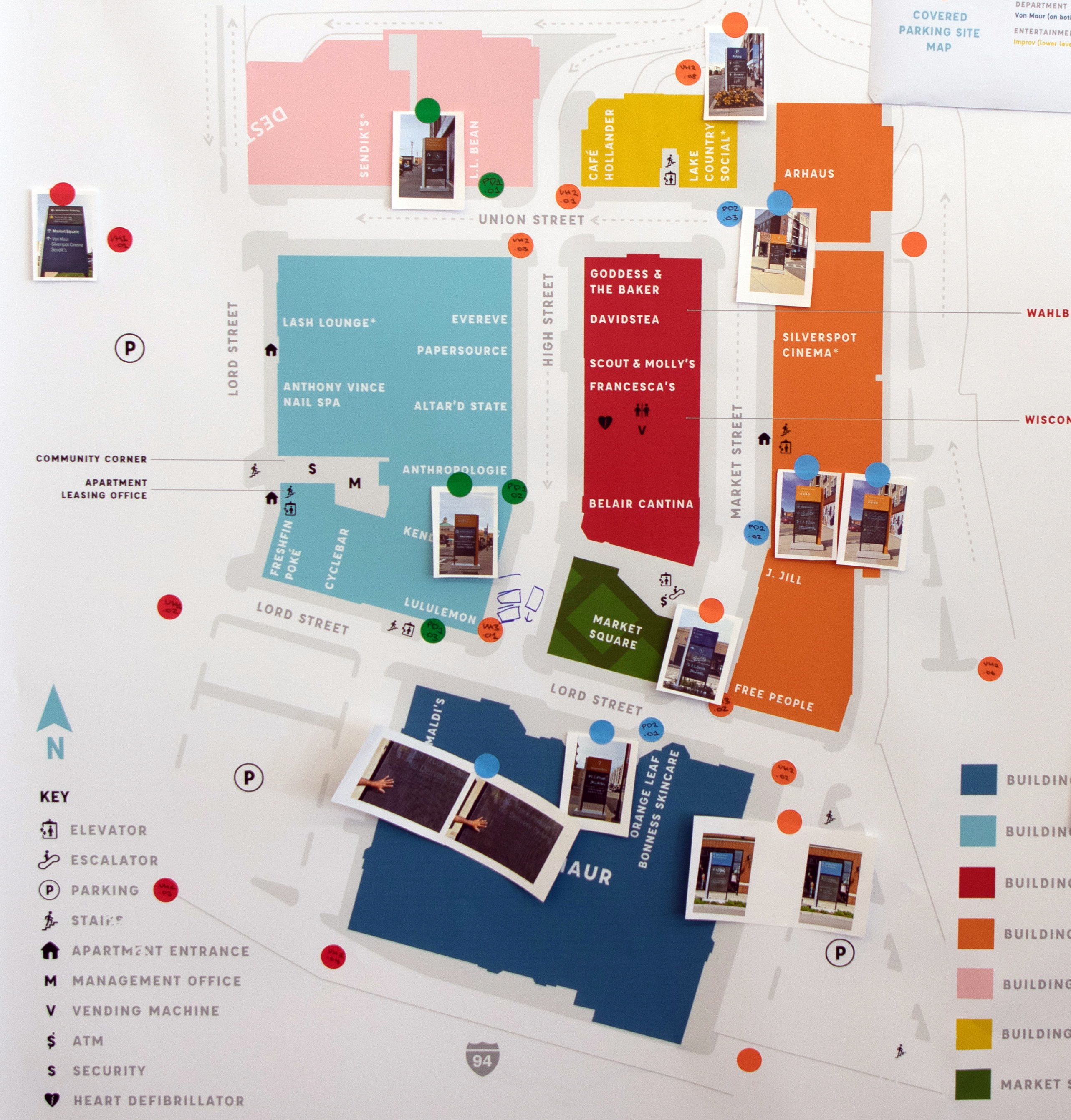
Key Issues
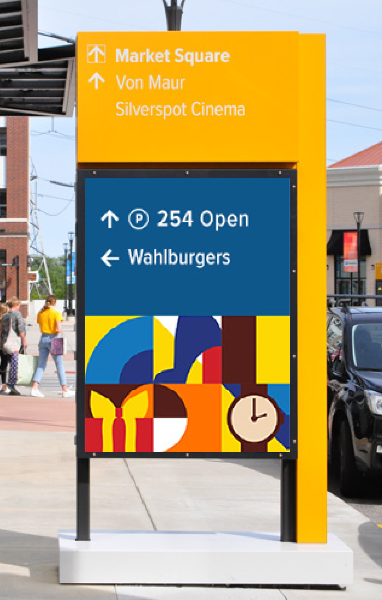
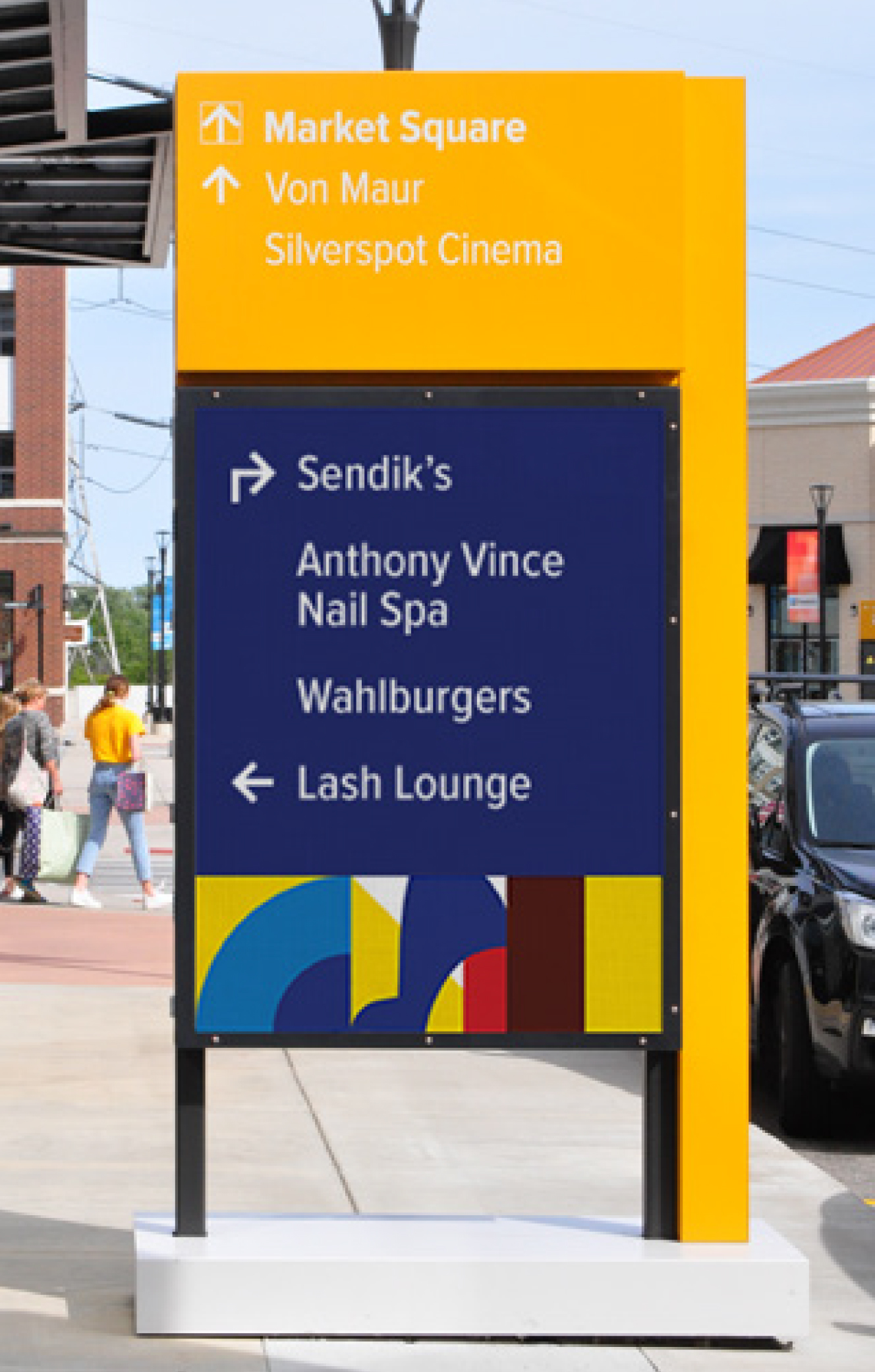
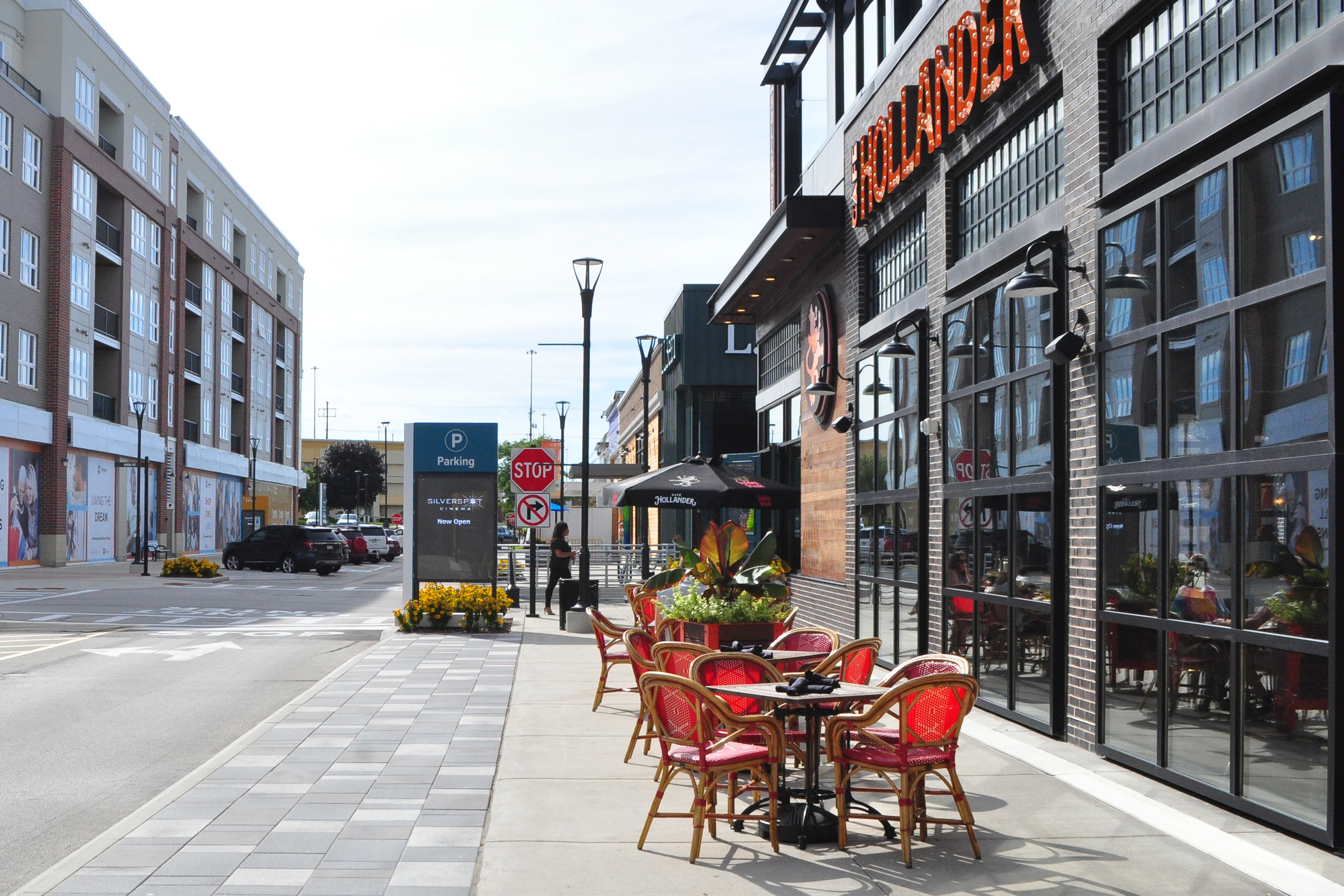
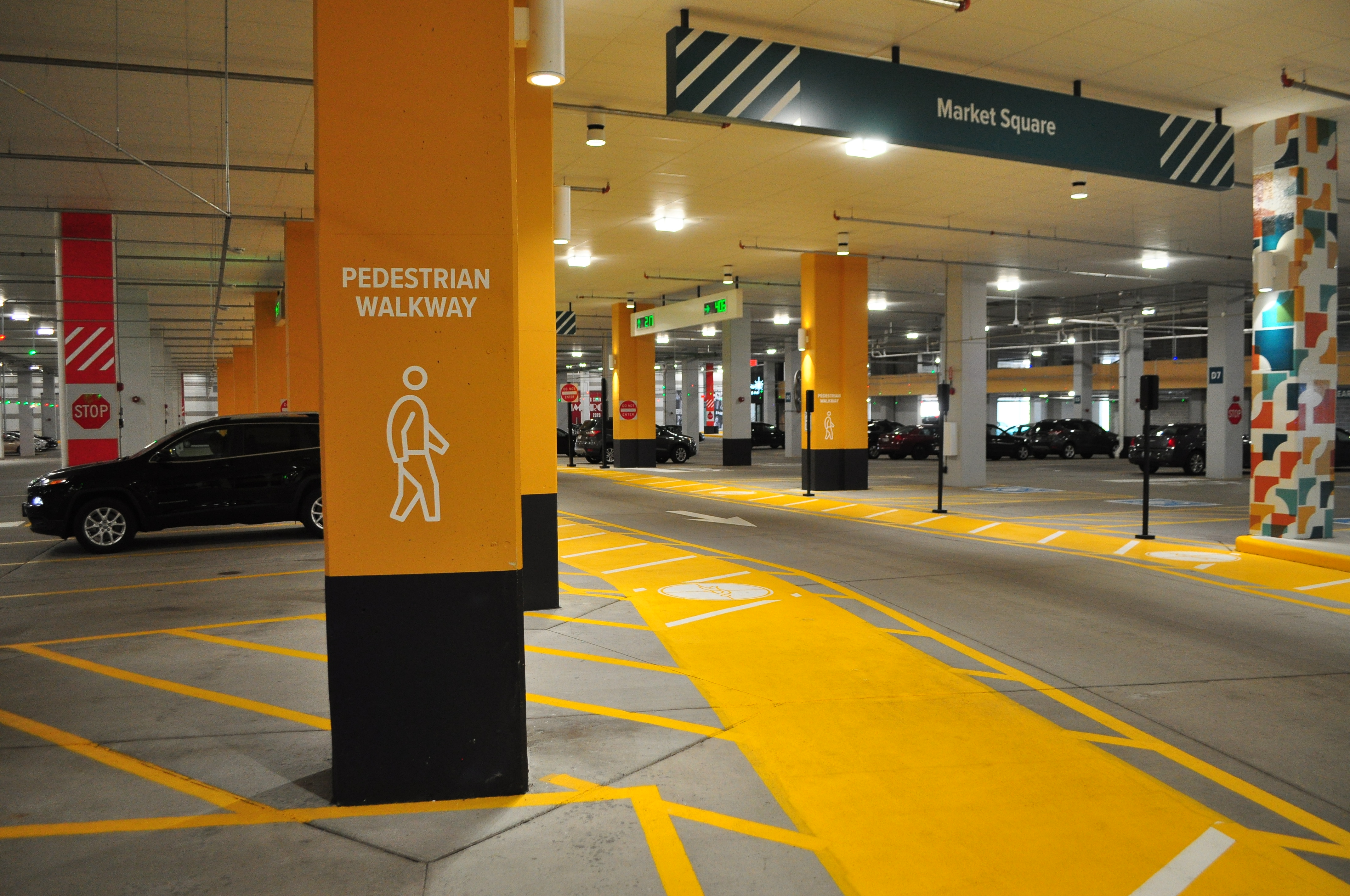
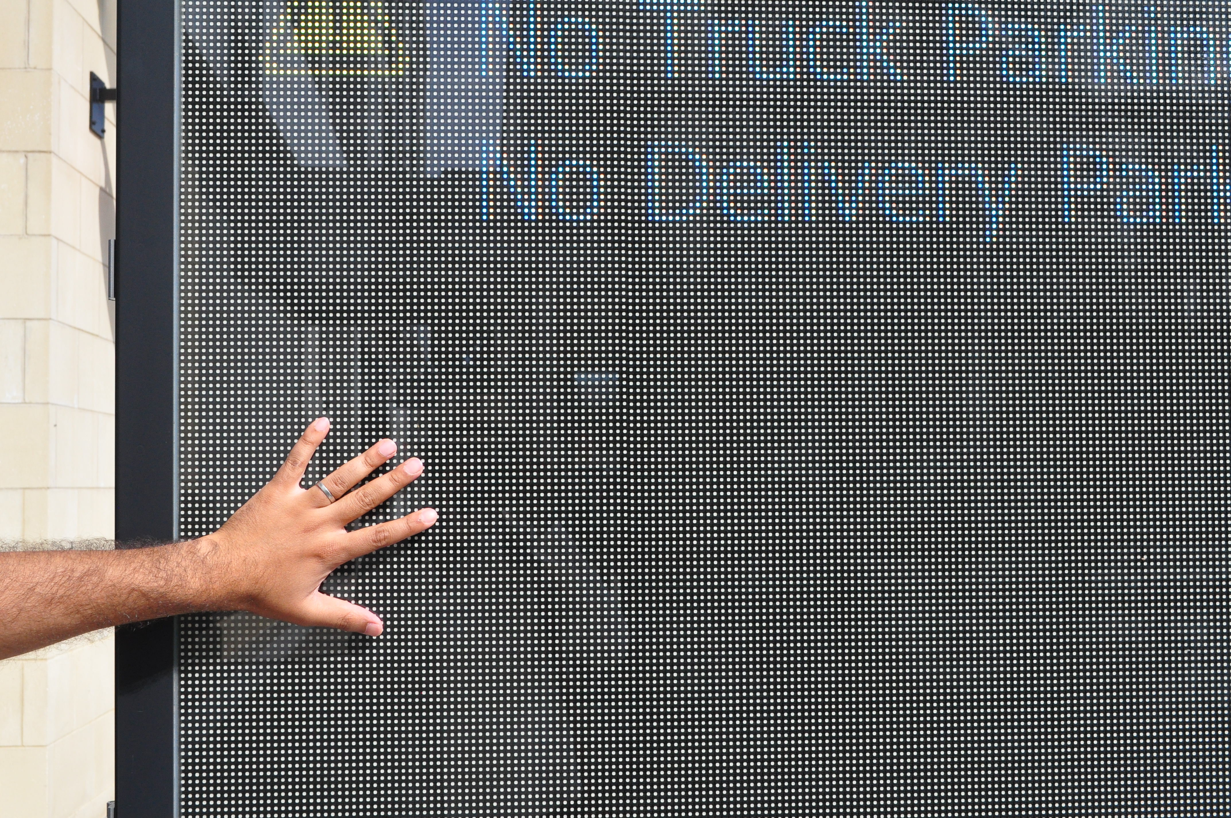
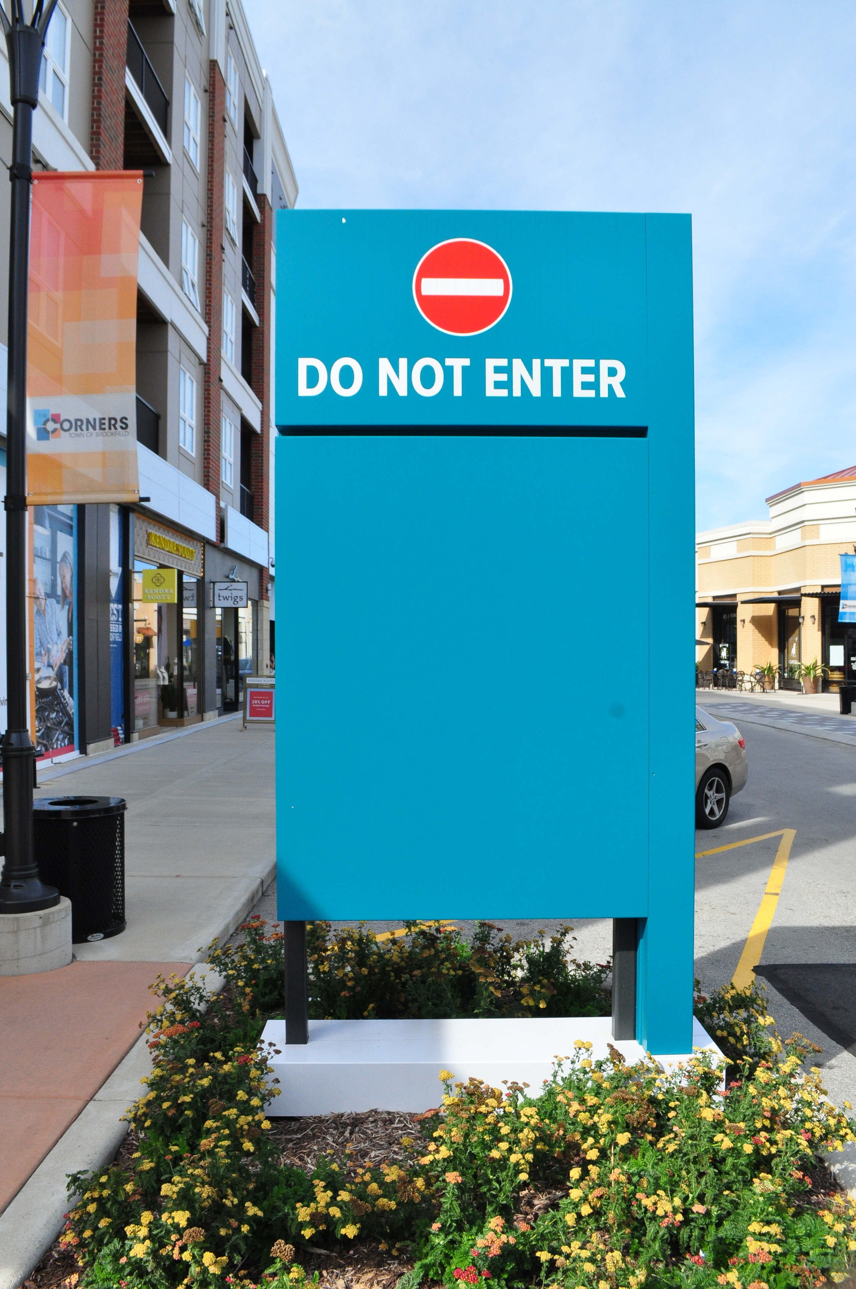
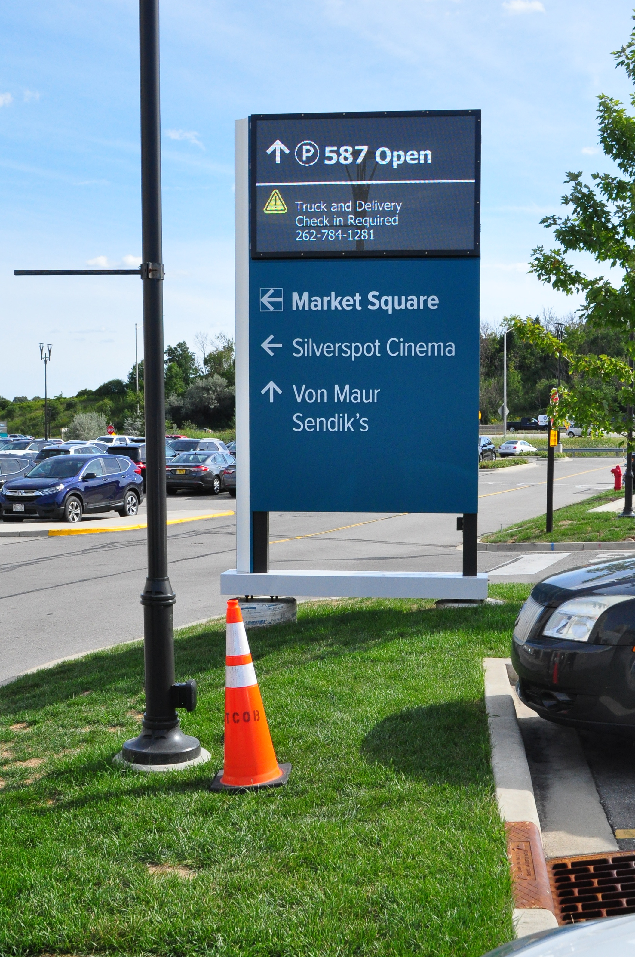
A large and abundant basement parking facility was going underutilized, with crowding at the ground level for limited parking spots adjacent to retail stores.Low-resolution screens were our tools across the site, placed at intersections and strategic locations for visibility. Their current resolution made them difficult to view from up close, and limited the range of messages displayed.
Aspiration
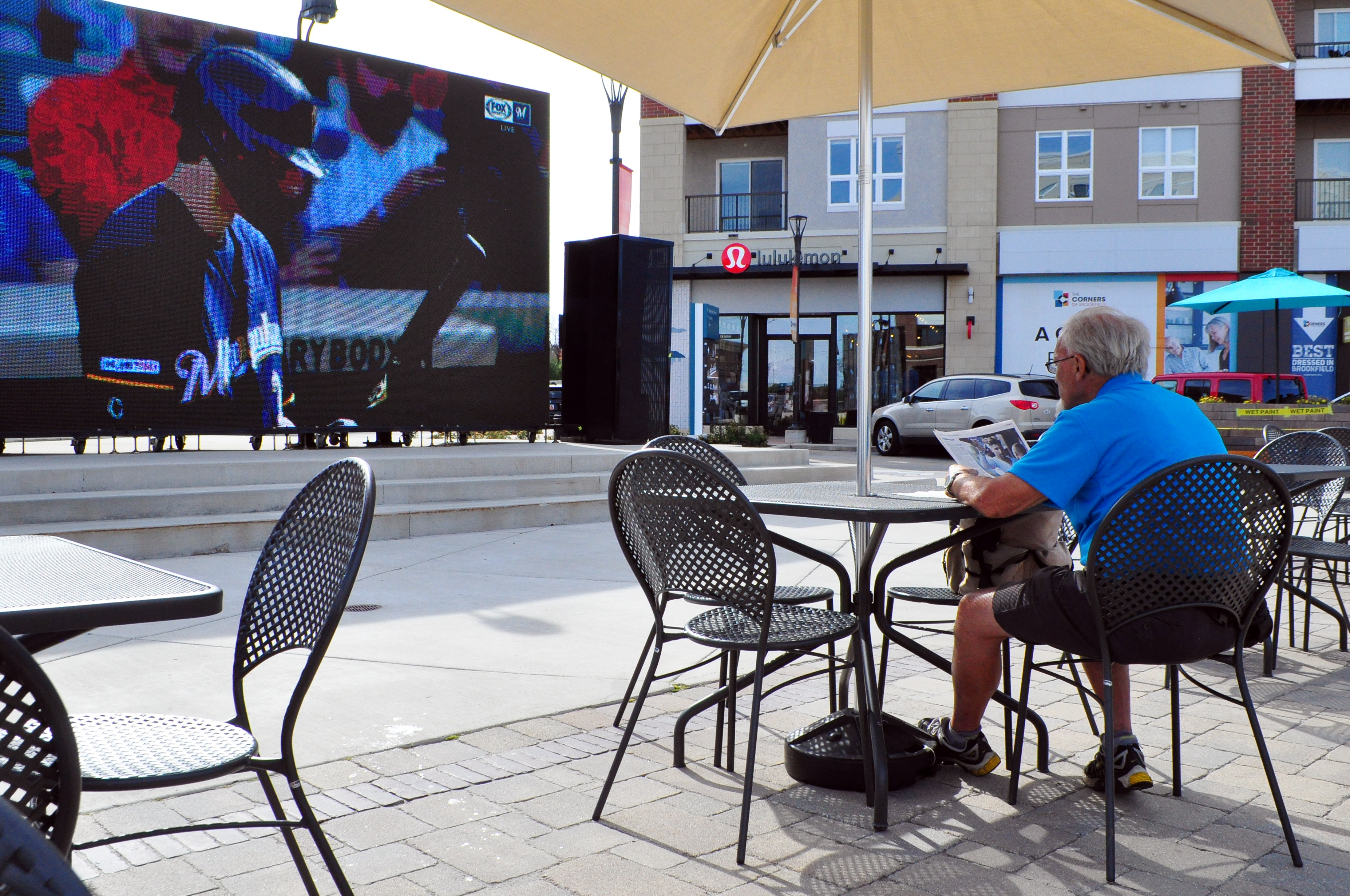
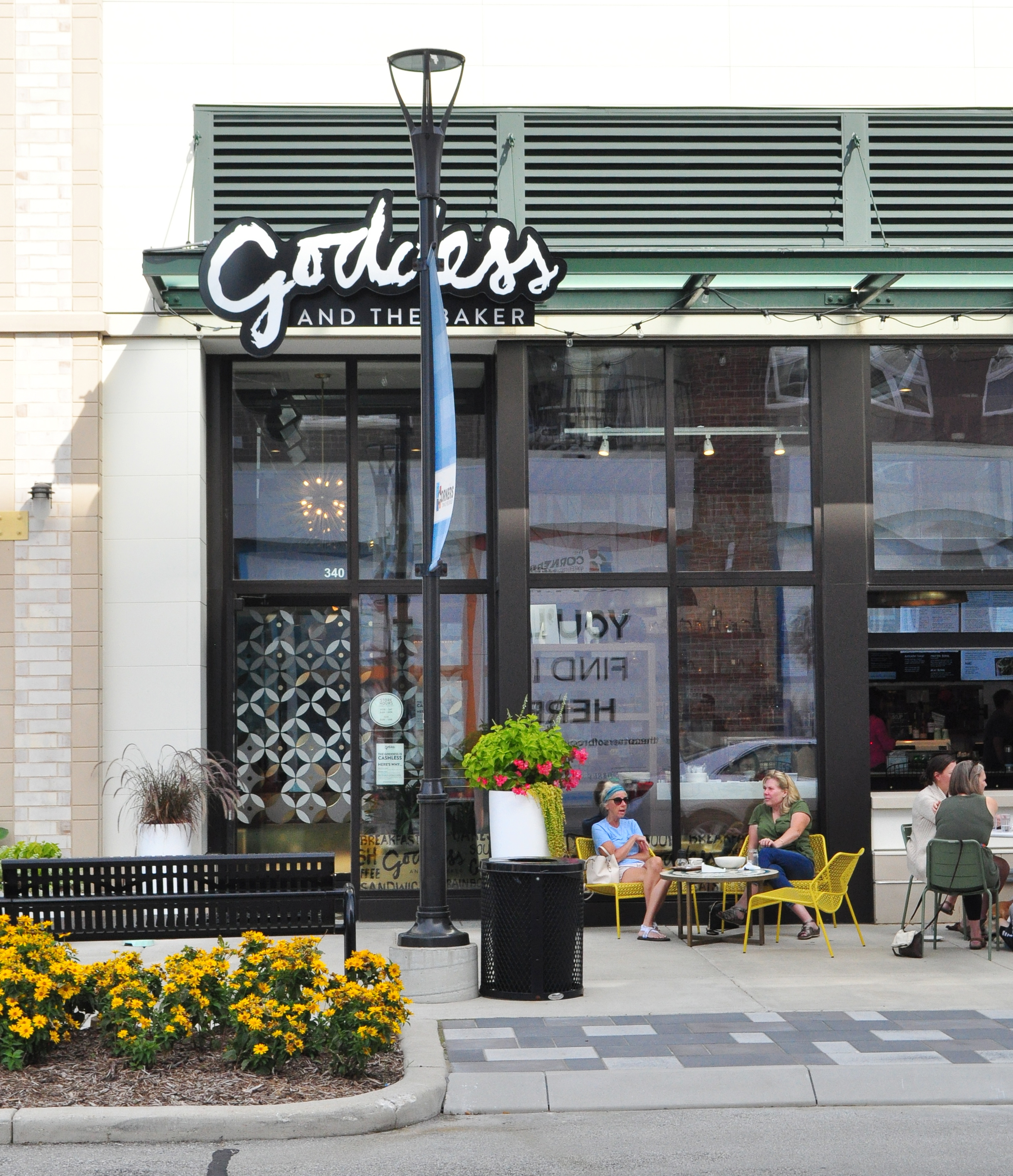
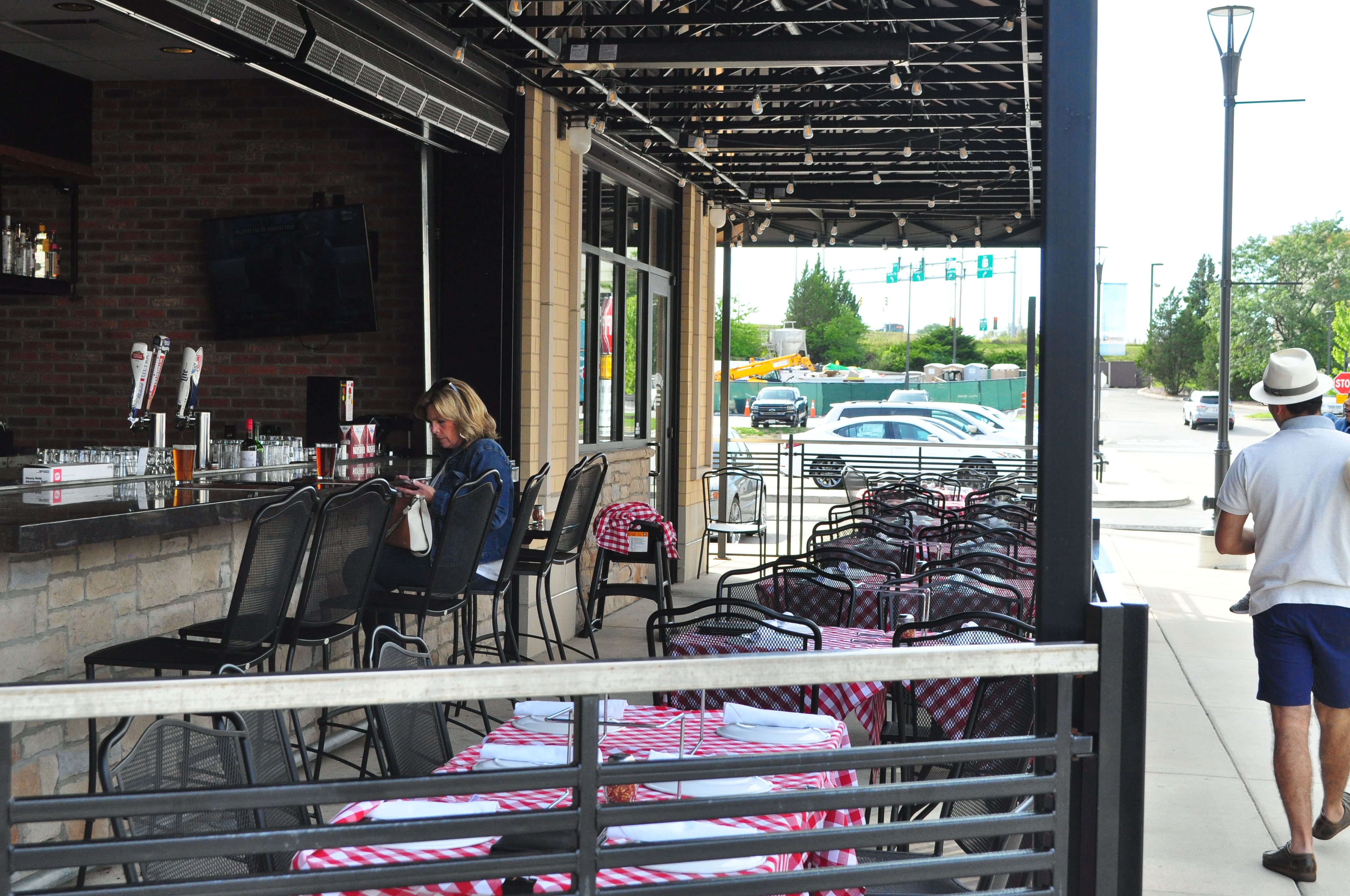
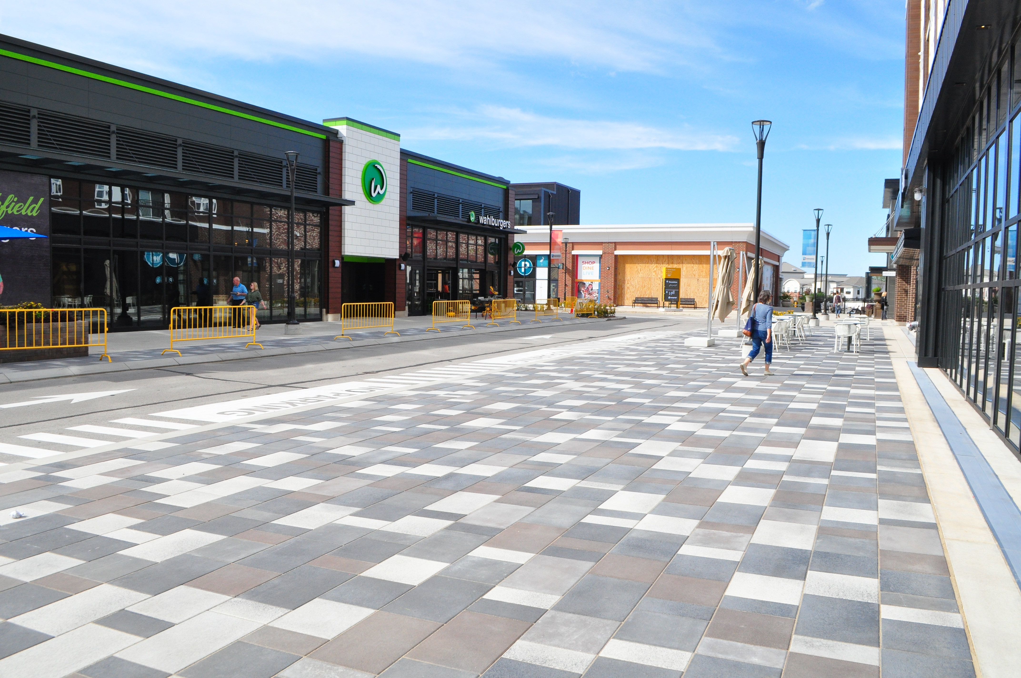
With an ultimate end goal of attracting more visitors, the core aspiration for the site was to become the ‘third place’ beyond the home and the office. A place where people come to do nothing and feel a sense of neighborly acquaintance.With a cinema, housing, grocery store, restaurants and bars, and retail stores arranged around an open central courtyard, the setting for this third place was perfect. Recently organized events, food-centric nights, and other activities were gaining popularity across the region.
Contextual Research
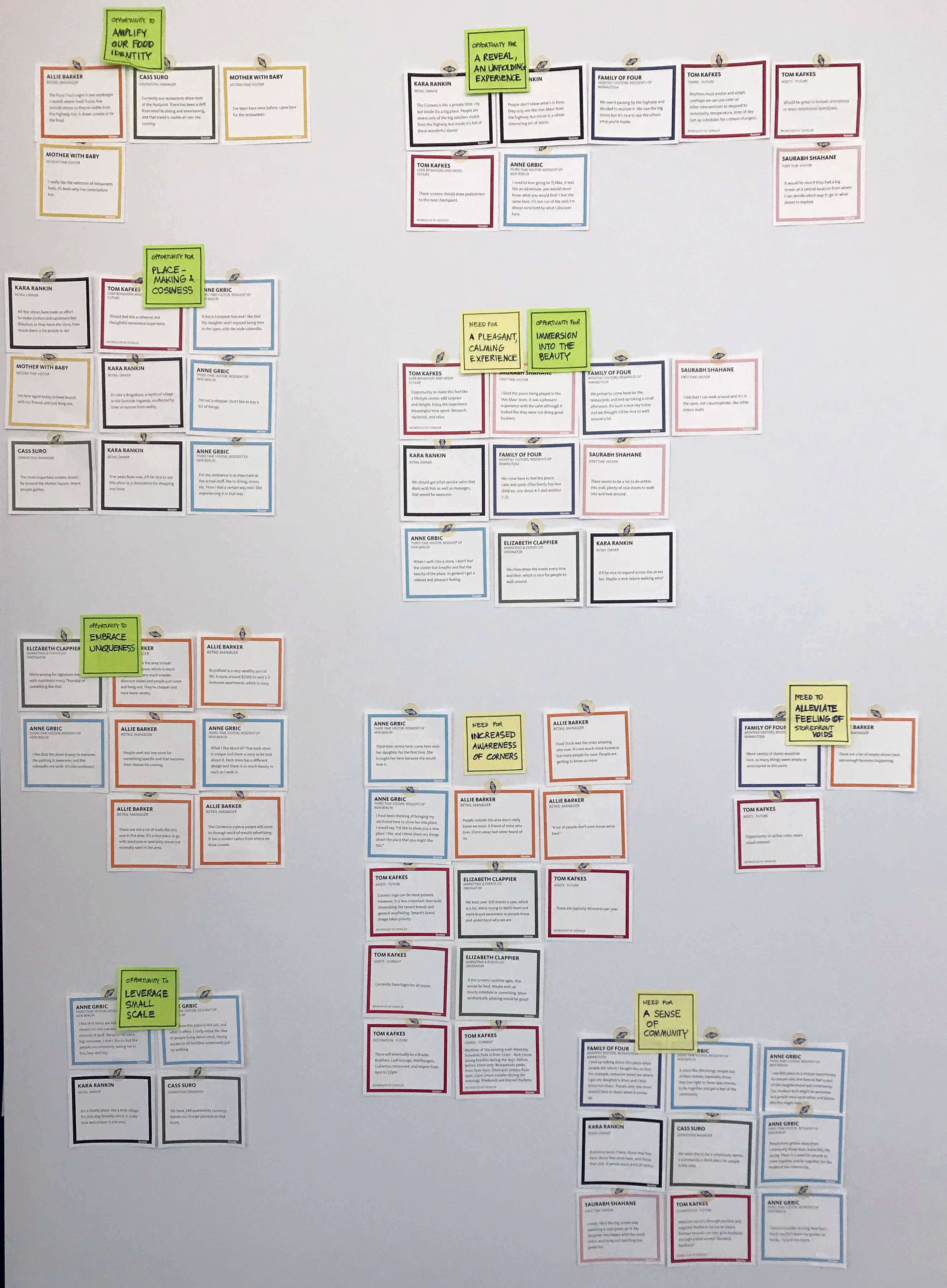
In order to better understand the vibe, experience, and reasons people visit the location, we immersed ourselves in the space. Conducting intercept interviews, observations, and self-immersions, we began to understand the pull and potential of this ‘third place’.Sensemaking and InsightsRecording all the observations from the contextual research as well as from client interactions, we began to cluster for patterns of unmet needs and opportunities.
Overall, it seemed like the location was seen as a delightful secret that visitors enjoy as a pleasant amenity in their neighborhood. Foundational attractions of the place were its unique stores, its air of beauty, and intimate sense of place.

Reframing the Opportunity
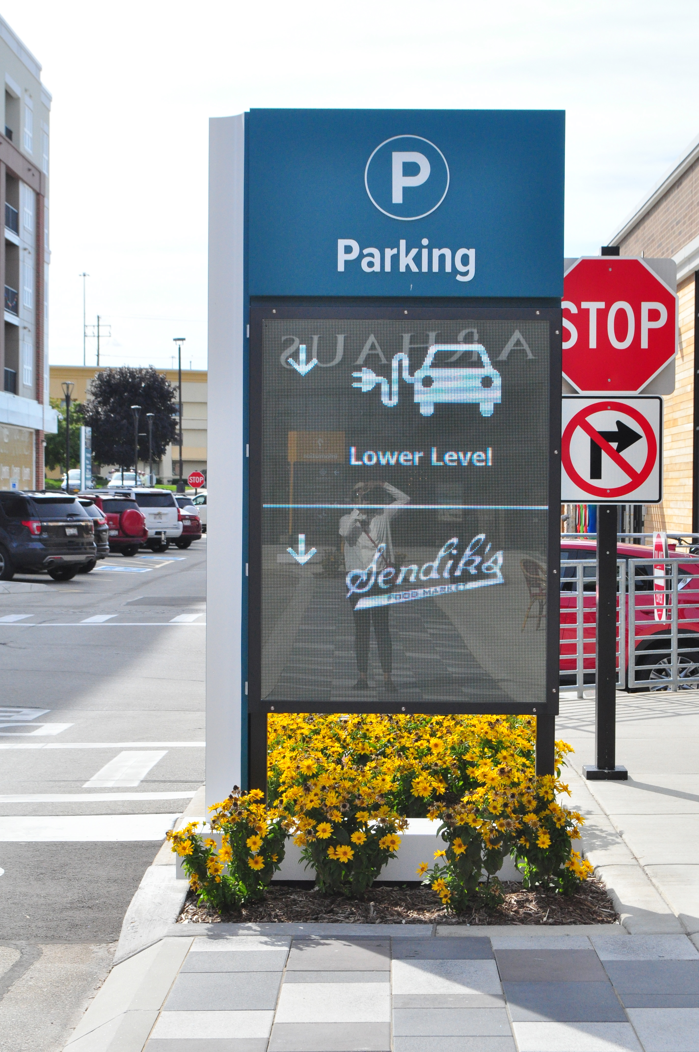
Against the broader goal of attracting more visitors to the site, capturing the beauty of the place was a more valuable opportunity for the existing screens than simply displaying directions. By boosting the unique sense of place, the navigation experience would be guided not just by signs but also the visual cues displayed across the site.Additionally, all design efforts would connect the ground level presence to the basement parking, furthering visibility to the underutilized facility.
Ideation
The team ideated on the Guiding Principles for the reframed opportunity, identifying numerous design interventions on the site.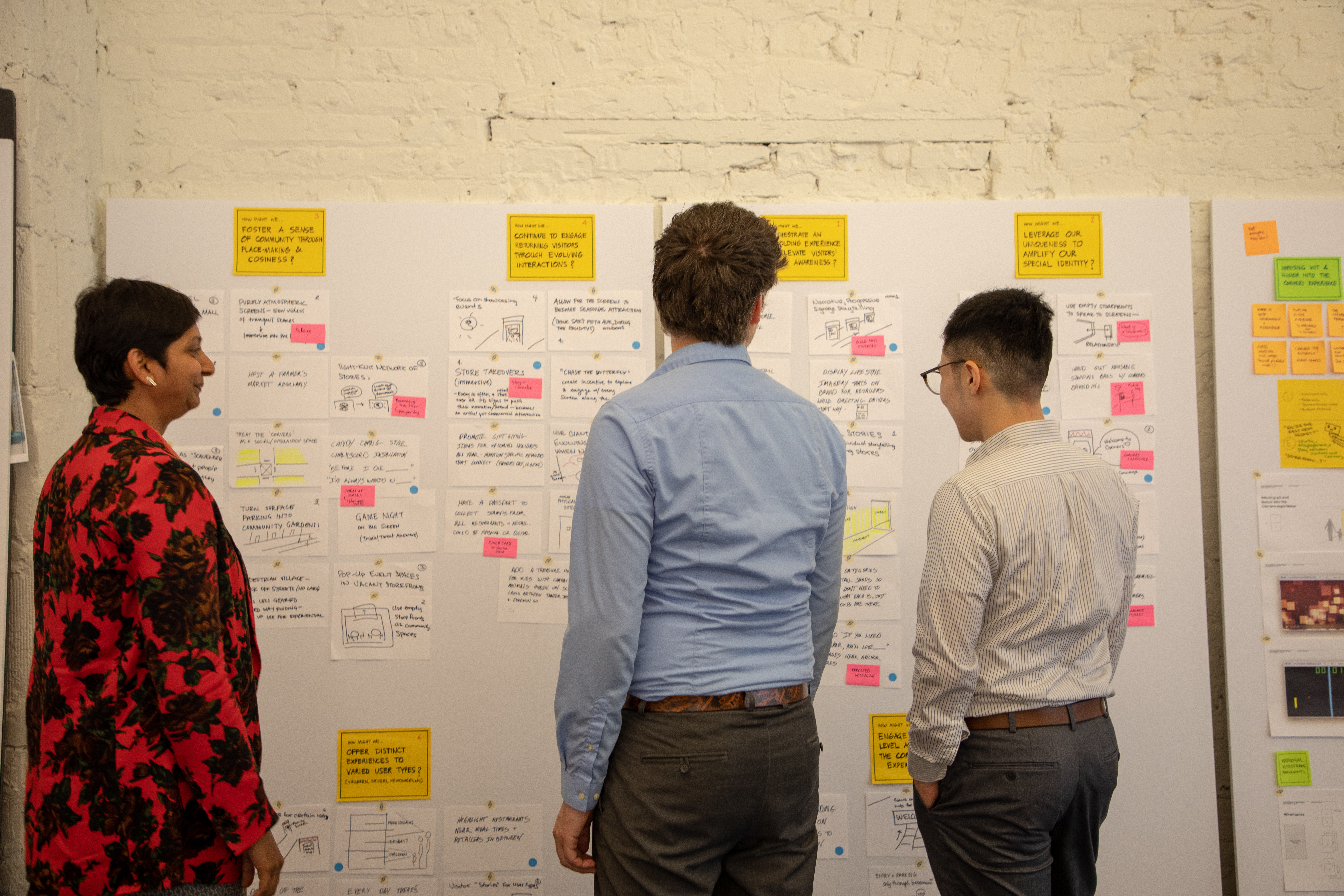
Design Language
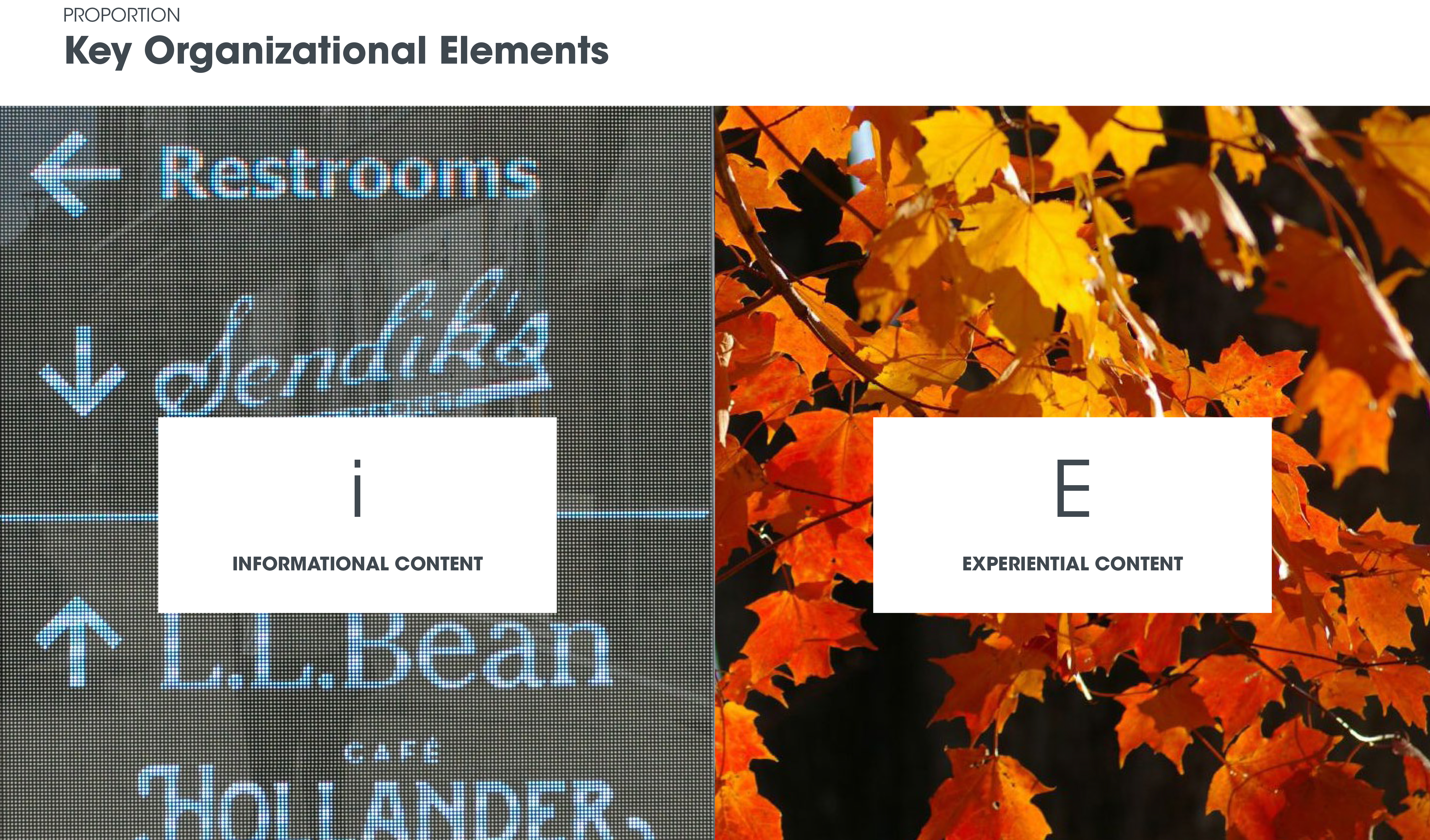
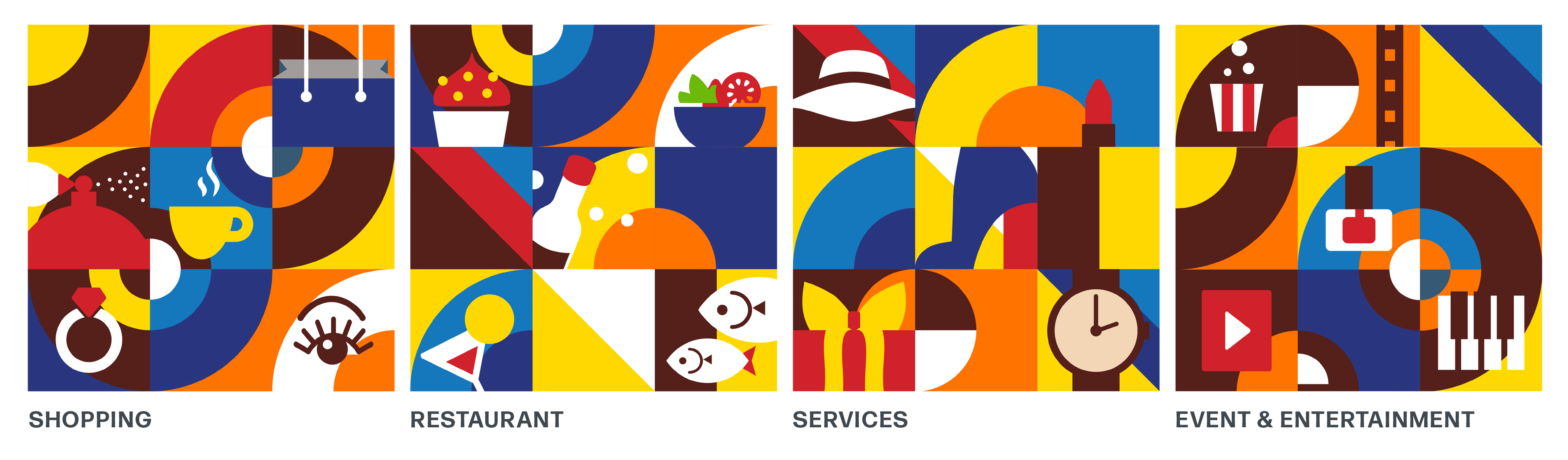
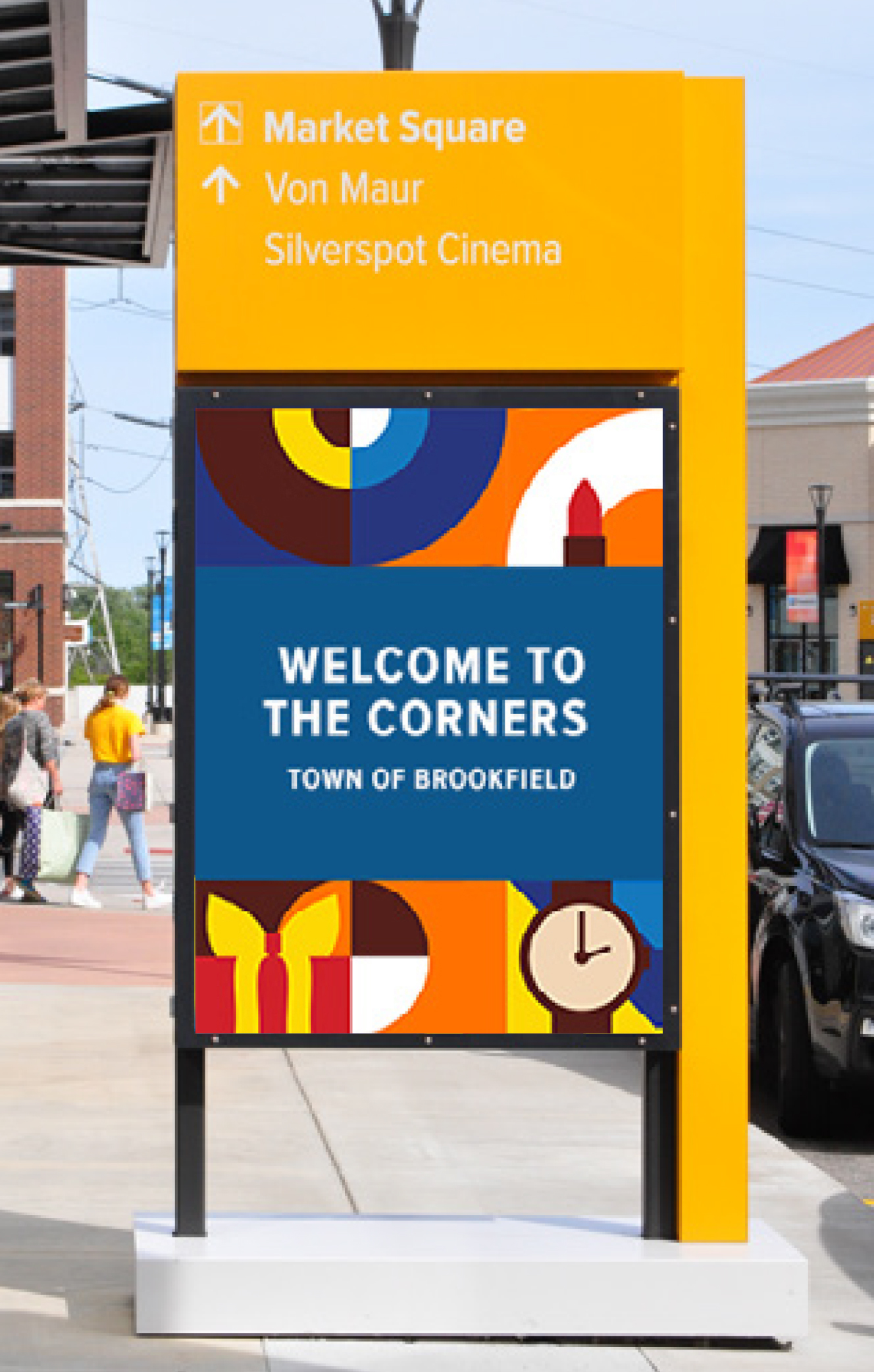
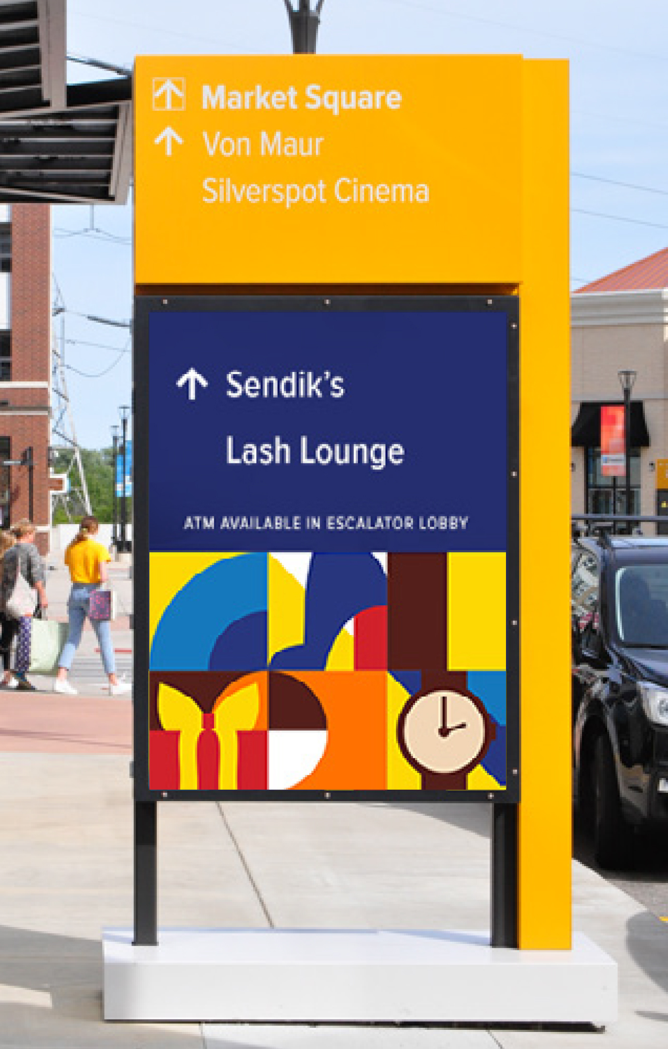
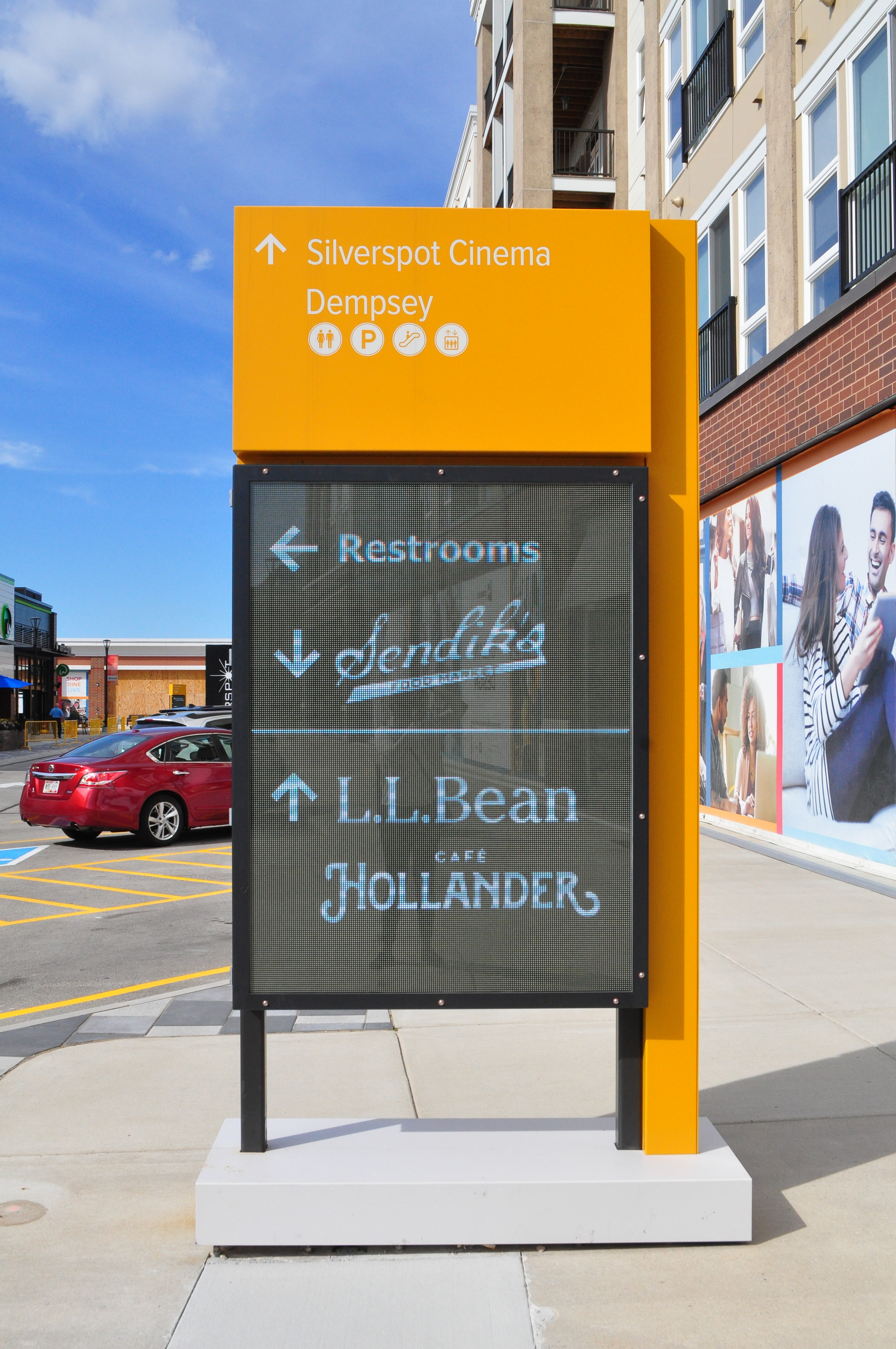
The existing screens with their unique low-resolution offered an opportunity to explore a new visual language for the design. Using bold and abstract visual elements, the team built a memorable design vocabulary.Informational + Experiential Content
Screens hosted both informational and experiential content, alternating between capturing a sense of place and specific directions across the site.